Hey folks! 👋🏼 I am starting a new series "UI Tips", where I will be sharing some quick tips to create better UI design and to improve the accessibility of the design.
So here is the first tip of the series 👇🏼
Make elements look clickable
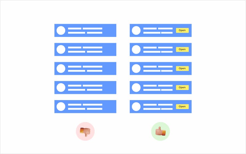
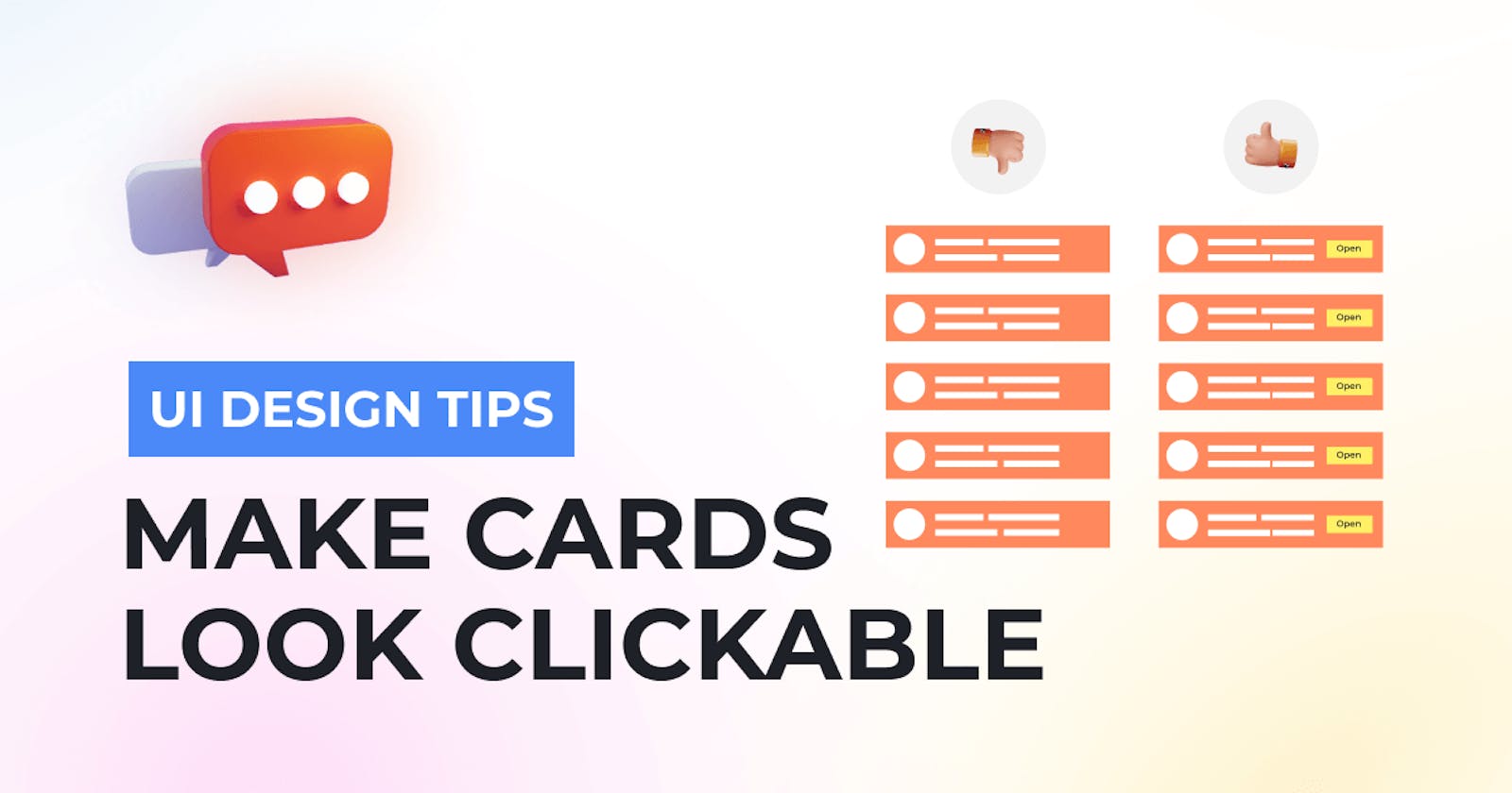
We all know the importance of CTA buttons. But in many cases, we omit buttons on our elements while designing and we only count on the user's experience and on animations/hover effects, etc.
Because of this common mistake, elements fail to indicate that they are clickable. Although, buttons are not required everywhere. For example, on a mobile screen, many types of cards are made clickable and do not need a button. But in many cases, users can not understand the actions needed to perform a task.

So always try to never leave things on user imagination and try to make it easy for users. Use an actionable button to describe the action and to prompt clickability as per the need.
I hope this will help you to create better and accessible designs. If you need more useful content like this, make sure to follow us on Instagram.
Thank you for reading, keep learning 💙

